Mixmag Magazine
THE COVER:


1) The title: why is it called that? What does the title connote?
The masthead of this magazine is mixmag which connotes that there is a variety of music inside, and also relates to the fact that it is mainly a dance music magazine, and contains a lot of dance mixes. By initially interesting the reader with the word mix, an impression is given that it has a range of articles to appeal to everyone, encouraging people to purchase it.

2) The masthead/title logo – analyse it.
The masthead is all lower case implying an informality in the content within; this may appeal to the younger readers which make up the majority of their target audience of 18-30 year olds. This lower case also contrasts to the rest of the writing on the front cover which is mainly written in upper case. It is significantly larger than the other text on the page to ensure that it draws the eye, and the use of white against the grey means that it is clear and easy to read. The dot on the 'i' in mixmag is altered to be more interesting and provide a recognizable feature to the font which may assist the creation of a brand identity. The title is on a layer behind the main image so that it even though it is still eye catching and clear to read, it doesn't distract from the main focus of the page.
3) Is there a strapline? Analyse it.
The strapline for this issue: ‘You wanna talk about the music..? Nina Kraviz. Let’s talk about the music.’ The main purpose of a strapline is to intrigue the reader and encourage them to buy the magazine and read the article. This strapline introduces the main theme of the article, which would obviously be music because it's a music magazine, but this demonstrates that it is a focused article with clear intentions to not stray from the subject into more gossipy topics. The question and answer concept in this strapline gives it some attitude and personality; its more interesting to read a strapline in this format rather than simply reading a statement to summarize an article. The use of informal language links to the informality of the masthead and also removes some of the distance between the reader and the article because it becomes more relatable and personal.

4) What is the main image? Analyse the facial expression, direction of gaze, body language,
clothing etc. How does this reach out toward the ideal reader identified above?
The main image is a medium shot of Nina Kraviz with a plain grey background. Her facial expression is alluring and interesting because she is doing a mixture of a smiling face and straight face; this makes you question what she is thinking about and therefore creates intrigue. Her direction of gaze is straight into the camera which helps to connect with the reader and make them feel more involved, as if the main image and article are targeted directly at you. Her body language displays confidence and strength, and with the military salute, also conducts respect for her and makes the reader feel as if she is in control. The position of her hand on her face also frames her eyes and enhances the effect of her looking straight into the camera. The military position also links to her clothing as she is wearing shoulder pads with embellishment which imitates a soldiers uniform. Her outfit looks appropriate for a night out due to the bodycon dress and the metallic effect of the fringing; these elements assist in complying with the house style and theme of the magazine.
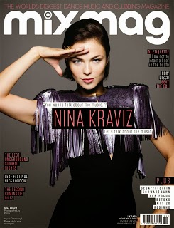
5) What others images appear on the front cover – why?
No other images were put on the front cover to keep attention directed to the main article, and not over crowd the page with images that would ruin its simplicity.
6) What content is promoted by the cover lines?
‘The best underground student nights’ – This is promoting specific events that have had positive reactions in the underground scene. To interest a certain group of people they have focused on students nights; this attracts students (who are known for having a high priority for nightlife) to buy and read the magazine, but also attracts other people who are not students, yet are interested in knowing about the best underground nights.

‘Leaf festival hits London’ – This is promoting an event which is soon to come to London. The terminology used such as 'hits' makes it seem as if many people have been waiting for this event, and that it is something that shouldn't be missed. This will attract residents in and around London, and also festival enthusiasts who would enjoy the experience.

‘The second coming of DJ EZ’ – DJ EZ is a well known artist and therefore having an article involving him encourages any fans of his to read the magazine. By announcing his second coming, the reader is influenced to believe that his return to the music scene is going to include songs which are better than before, interesting both his fans and any dance music lovers.

‘DJ ETIQUETTE how not to start a beef in the booth’ – This promotes what life in like for DJs when they are in the booth, and how they can avoid starting trouble with other DJs with a list of do's and don'ts. The main text is upper case and a different colour, and then a small explanation of the article is beneath. The language used in this short cover line is very contrasting because 'etiquette' is a formal term used for appropriate behavior, and then 'beef' is an informal term used mainly by youth to connote an argument or disagreement.

‘How disco beat the EDL’ – This promotes in what ways disco music defeated some issues with the EDL. This article explores some political aspect of music and how it has changed and developed over time. The onomatopoeia used with 'beat' creates an image of a physical fight and conquering of EDL; subsequently this adds interest and helps persuade the reader to purchase the magazine.

7) Explain the connotations of typefaces (fonts), graphics, colours etc.
The graphics on the front cover are all clear to read due to the black outline, and they are straight to the point, indicating that this will continue inside. Pink is used on parts of text to indicate the most important words, and although this would usually be associated with a female market, the very light shade of pink paired with the greys, blacks and whites, create a more youthful and edgy aesthetic, rather than girly. The writing is done in a plain, mainly upper case, sans serif font to make it clear to read and different to other magazines on the market. The simplicity of the typefaces, graphics and fonts indicate that they writing does not require additional embellishment to create interest, because the articles have enough substance in themselves to encourage you to read them.
8) What sort of language/ language features/ language devices/ can you identify? How does the cover ‘talk’ to the reader?
The strapline about the main feature of this issue uses a question and response to add interest and encourage the reader to respond to the question 'You wanna talk about the music..?', personally connecting with the reader. The concise cover lines provide quick explanations or interesting points about the main articles, preventing the reader from understanding too much about the article, and therefore not bothering to purchase the magazine and read the full piece. Another language device used is alliteration in 'beef in the booth', which simply makes the statement more memorable and interesting to read. Informal terms such as 'wanna' and 'beef' relate to a younger audience because they feel familiar with this language and therefore believe that the magazine has relevance to them. Words such as 'hits' and 'beats' enhances the impact of the coverline upon the reader, and is more effective in creating interest than using a more conventional alternative, for example, writing 'Leaf festival hits London' is more persuasive than writing 'Leaf festival comes to London'.


9) Does the cover look similar to other magazines? If so why? What does this magazine offer which rivals don’t (ie what is its USP)?
This magazine has elements which are similar to other magazines such as its simplicity and medium shot of an artist as the main image, but the informal language paired with the specifically targeted articles (such as 'The best underground student nights') provide a unique selling point, and form a strong brand identity. It also has a short slogan which other magazines do not have, and this creates another original element that can be easily associated with the magazine, making it more memorable: 'THE WORLDS BIGGEST DANCE MUSIC AND CLUBBING MAGAZINE'. It also has a cool, young, edgy aesthetic which other music magazines may not have due to the age of the magazine itself, the genre of music they are promoting, or the age of the target audience.

10) Is there anything else distinctive about the cover/format? (eg size)
The masthead and strapline are significantly larger than the coverlines, making them stand out and illustrating their importance. All of the coverlines and the strapline have a dark box around them to enhance the contrast between the writing and the background, subsequently making it more eye catching and easier to read. The coverlines are aligned against which ever side of the page they are on, this balances out the page and makes it more aesthetically pleasing because the coverlines line up, and prevent a messy, unorganised appearance.

THE INSIDE:
1) How many pages are there?
There are 60 pages in total.
2) How many pages of adverts?
25 pages out of 60 are advertisments.
3) Categorise the products advertised into types.
CD's/Downloads, Concert tickets, Young fashion, Technology, Drinks


4) Make a list of the features/articles topics in the magazine..
Music, Young fashion, Lifestyle, Youth, Clubbing industry and Events.
5) Categorises the features/articles into types.
The editorials in this magazine include articles under the category of interviews; Nina Kraviz, Sub Focus, Betoko and Mat Zo are interviewed and this takes up a large portion of the magazine. The interview with Nina Kraviz has 4 double page spread and is the main feature of this issue. Another large percentage of the magazine is used to review different products, both music and fashion related in order to advise the readers on what is best to buy. Musical reviews on new products such as DJ mixing desks and headphones/speakers are reviewed
because they are almost certain to interest the reader. Some fashion reviews include an article about a new brand of high end shoes; music and fashion usually relate to each other and therefore fashion features would be very popular in music based magazines. Upcoming concerts/festivals/fashion shows are in this issue of mixmag and can be categorised under events articles.
6) How many double page spreads are there? What are they about?
In total there are 35 double page spreads which means that the majority of articles are double page spreads.
1. There are interviews with a range of young people, asking them about their lives and their favourite places to relax and hang out.
2. The best places to go out clubbing in the previous month.
3. Matt Zo interview.
4 - 8. Nina Kraviz interview
9. How to become a successful DJ
10. Black Magic interview
11 - 13. DJ Interviews
14. Student survival guide
15. Interview
16 -19. Autumn fashion trends
20 - 27. Current music
28. The UK's best festivals
29. UK directory
7) Are there any ‘advertorials’ where it is not clear if something is an article or an advert, or a mixture of both?
There is an advert which is promoting the same topics and using the same colour schemes as an article which makes it difficult to differentiate between the two. It has more information on it than a usual advertisement, therefore it's an advertorial.
8) How does the magazine achieve a unified ‘house style’? Think about language and mode of address, colour schemes, graphical elements, etc.
The house style is consistent throughout because of the informal, youth appropriate language used, which appeals to their target audience. Dark, block colours are used, and graphical elements that emulate the colours and lighting that would be evident on a night out clubbing are used frequently; this helps emphasis the genre of music this magazine is promoting. Clear, unpixelated images are used, usually with a squared or rectangular shape, this is another element which creates a solid house style.
9) Why is this house style appropriate to the target audience? What assumptions does it imply about the TA?
The design and graphics are very contemporary, and the pages have a simple, clear layout which would appeal to a younger market. Other magazines that may appeal to an older market or a contrasting music genre may go for a more crowded, 'homely' feel to the layout and design, but this magazine is created to reflect nightlife and partying. The assumptions made are that the reader enjoys listening to dance music, going out to clubs, and takes an interest in fashion are obvious due to the topics of articles, and the images/design elements in place.
No comments:
Post a Comment